Marina Wealth Advisors: Redesigning a website for wealth advisors to collect leads
Marina Wealth Advisors is a fiduciary wealth advisory and management firm in Los Angeles. They approached me to help them redesign their website to better resonate with their target demographic of high net-worth individuals, and transfer everything from Squarespace to Wordpress.
About the project
My role
UX Design
Project Management
Content Strategy
Web Development
Team
Just me
Timeline
April 2022 - Aug, 2022
Tools used
Figma
Wordpress
Problem & Opportunities
Problem statement
The current website on SquareSpace does not speak to the user that we have now discovered over time. It feels too playful for the demographic. The team has invested in sending cold emails and needs a site that interested leads can go to contact us.
Problem & Opportunities
Business Case
01
“We need a site that is easy for leads to quickly inquire and/or set up a call with us directly”
02
“We need a site that better represents us as trusted, experienced, and attentive.”
03
“We need a site that can be more customized and better scale over time to have things like tutorials, help center, and access points for private clients only”
Problem & Opportunities
Product Goals
Create a foundation
Move the domain from Squarespace to WordPress so that it is easy for the team to login and make changes over time
Update styles
Design a website that feels less playful and more sophisticated, to better represent the business as well as be relatable to the target demographic
Test & Iterate
Install FullStory so that we can have better transparency into how people are using the website, so we can quickly make changes that lead to higher conversions
Design
Design Principles
Meet the user's needs
Learn who our users are, what they’re looking for, and tailor an experience that is relevant to them
Keep it simple
Avoid jargon and create layouts that are easy for non-technical people to understand
Usability first
Test often and make sure that the website it usable from all Desktop, Tablet and Mobile devices
The Before
The original website was a great start. It utilized Squarespace’s user friendly templates and blocks, and had nice subtle animations. However, much of the illustration seemed too juvenile and not relatable for high net-worth individuals. Additionally, the monotone color scheme and solid white background made the overall brand fall flat.
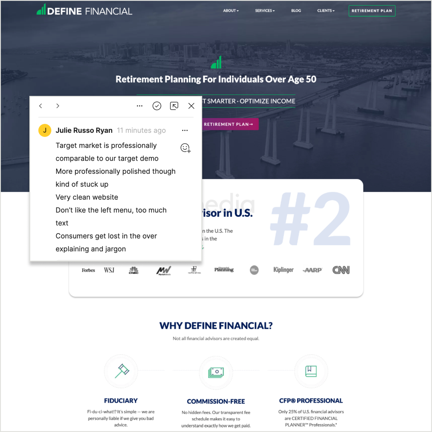
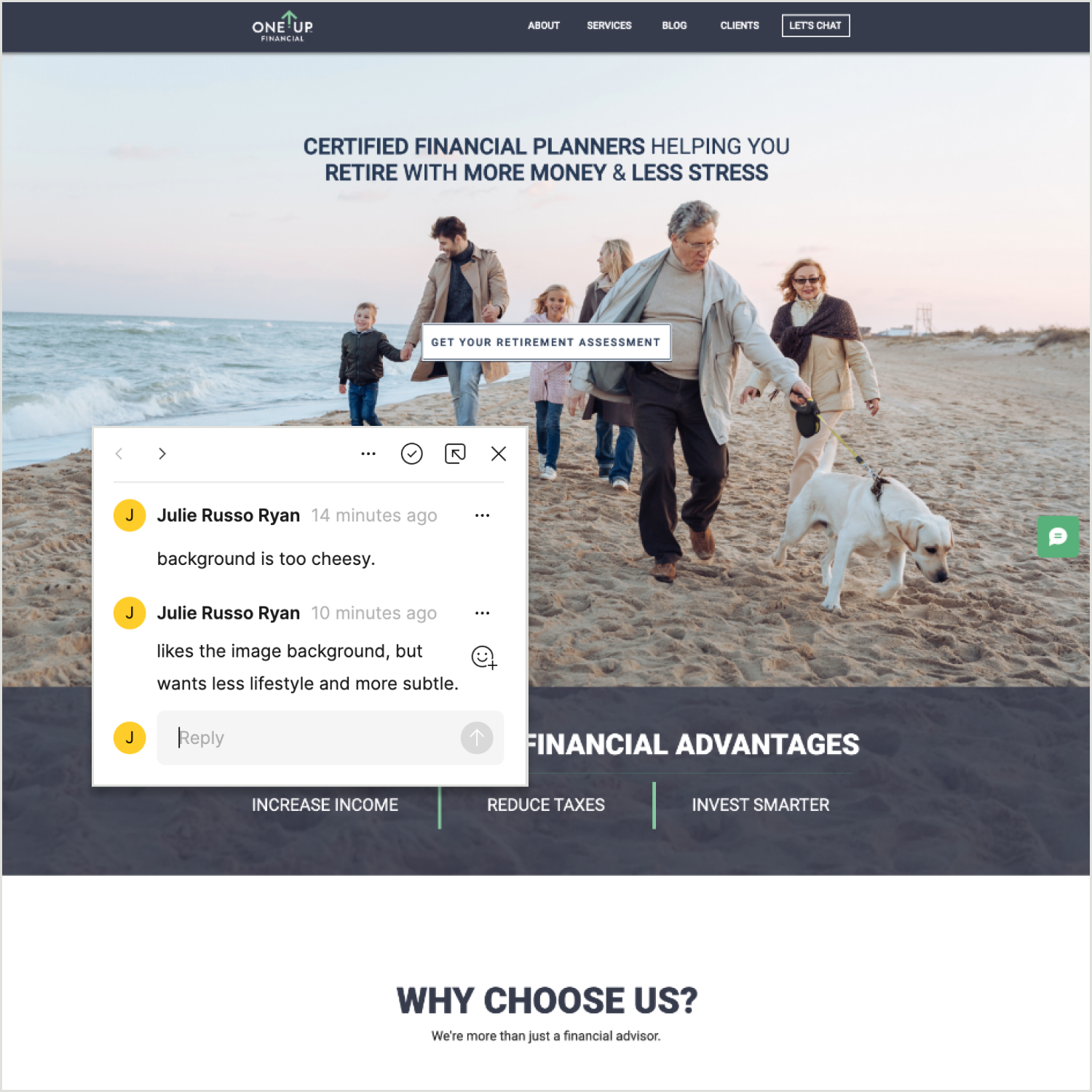
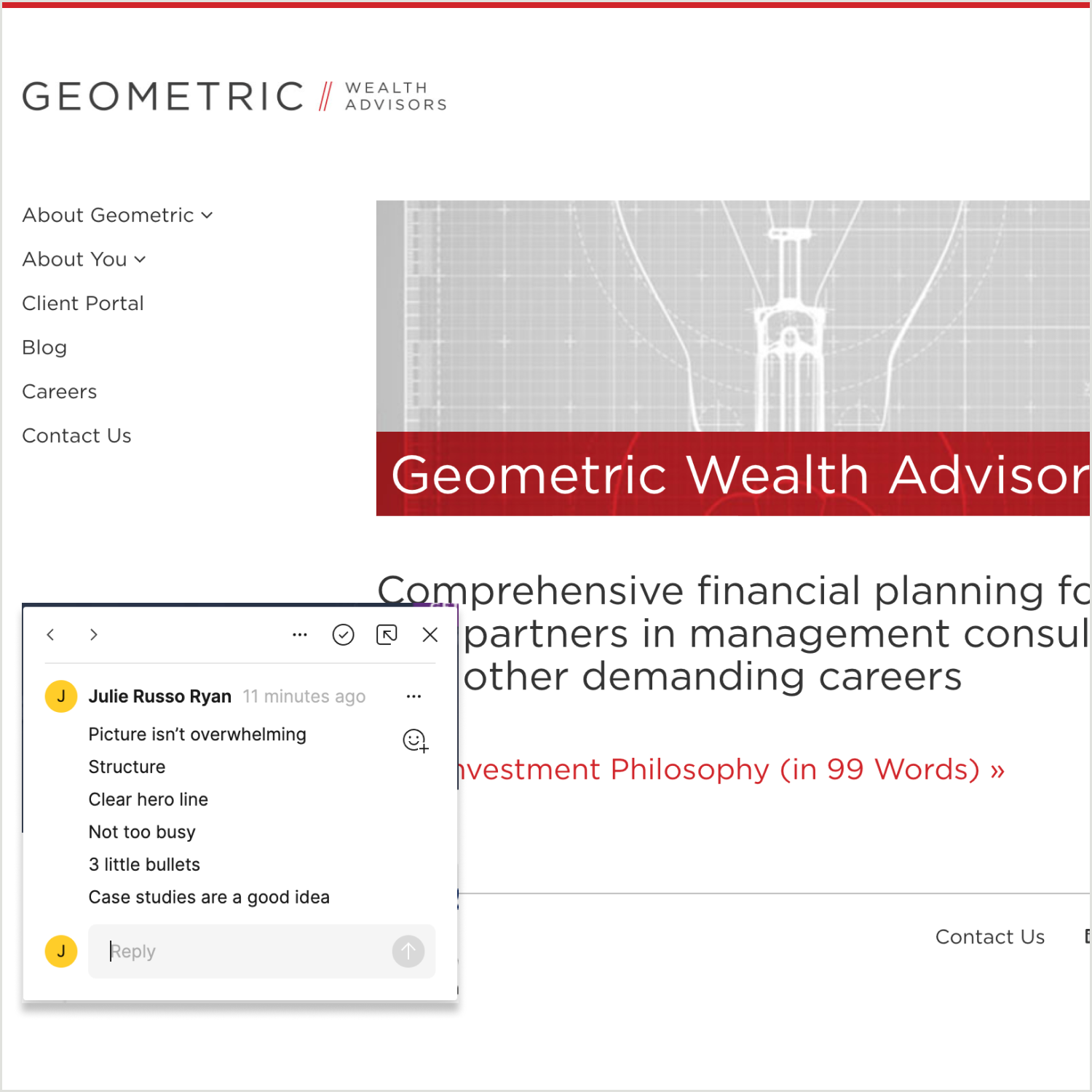
Defining Style
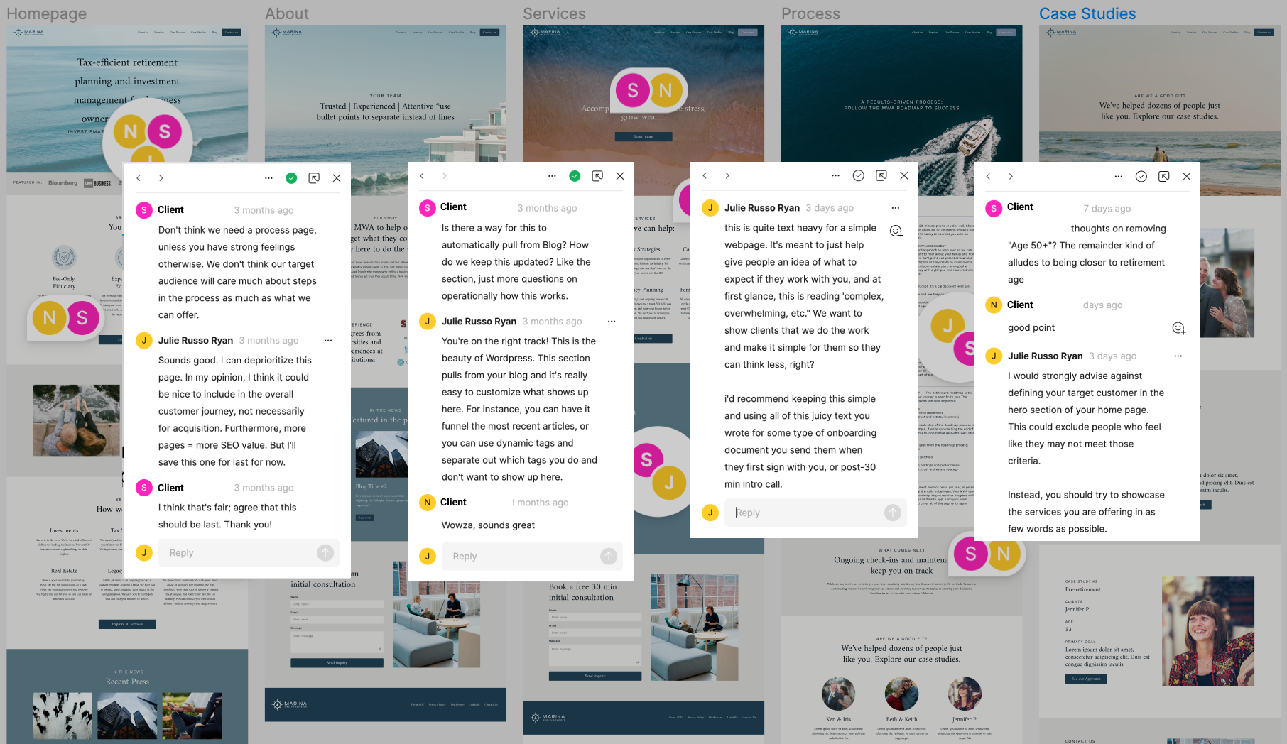
I asked the clients to gather a few websites from competitors as a reference, then I led a workshop where we talked through design elements that they liked or didn’t like.
Low Fidelity Ideas
Content strategy and Iterations
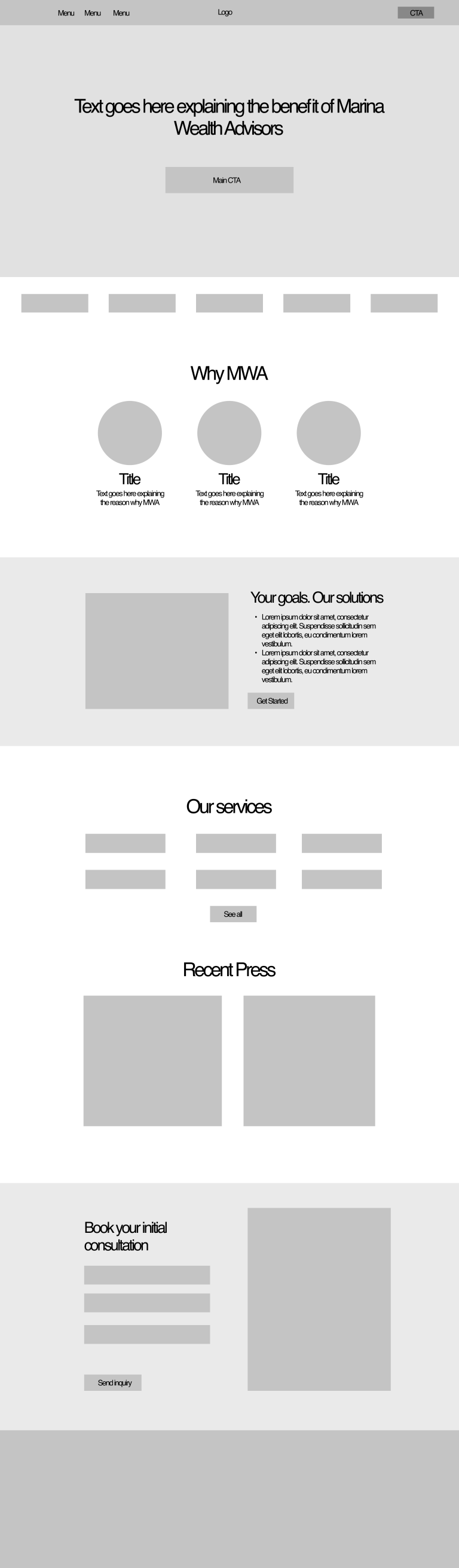
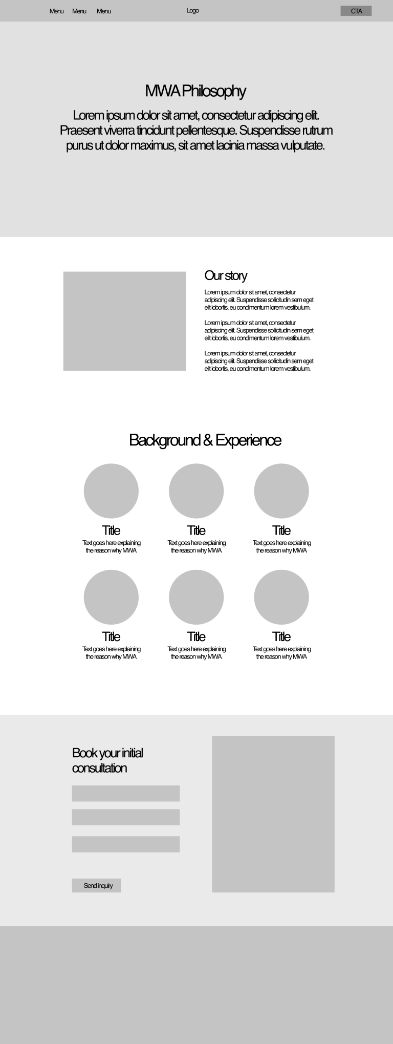
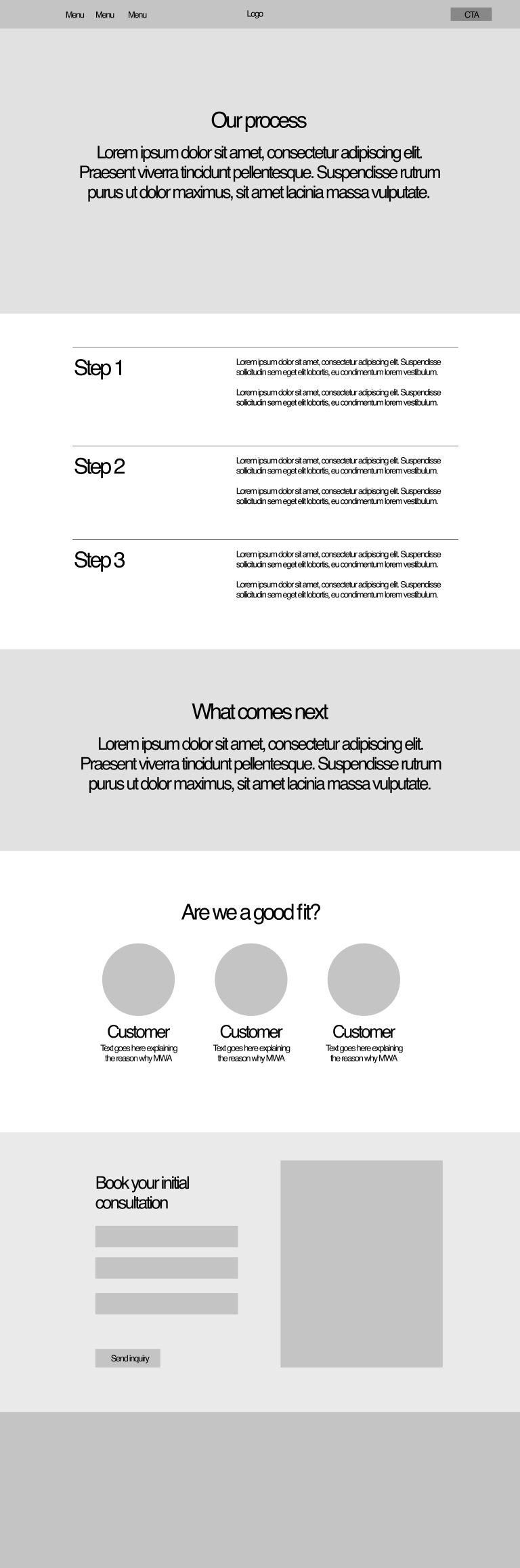
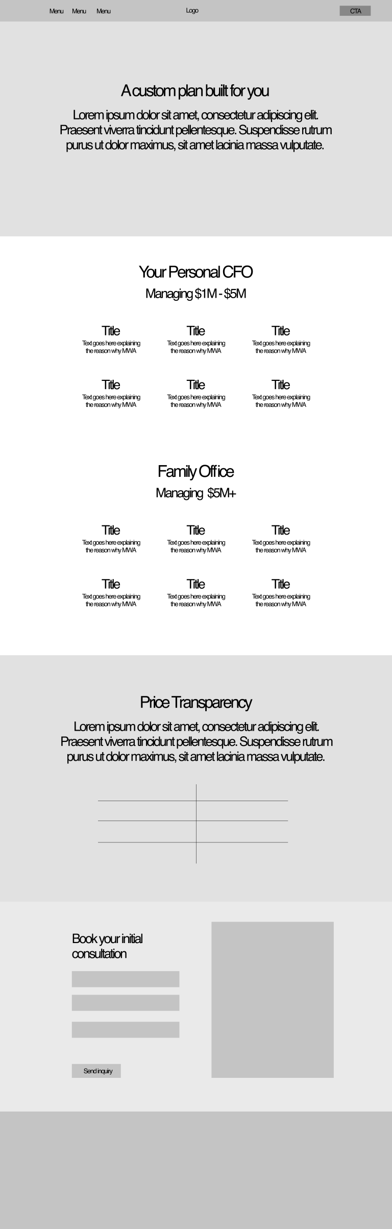
High Fidelity Wireframes
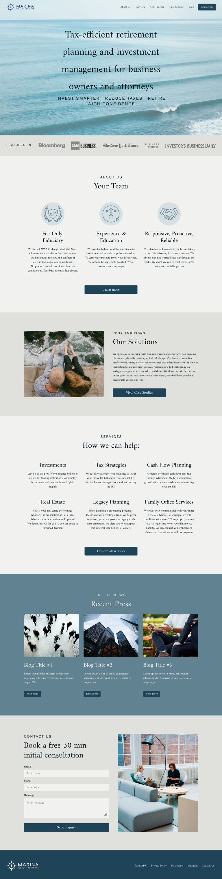
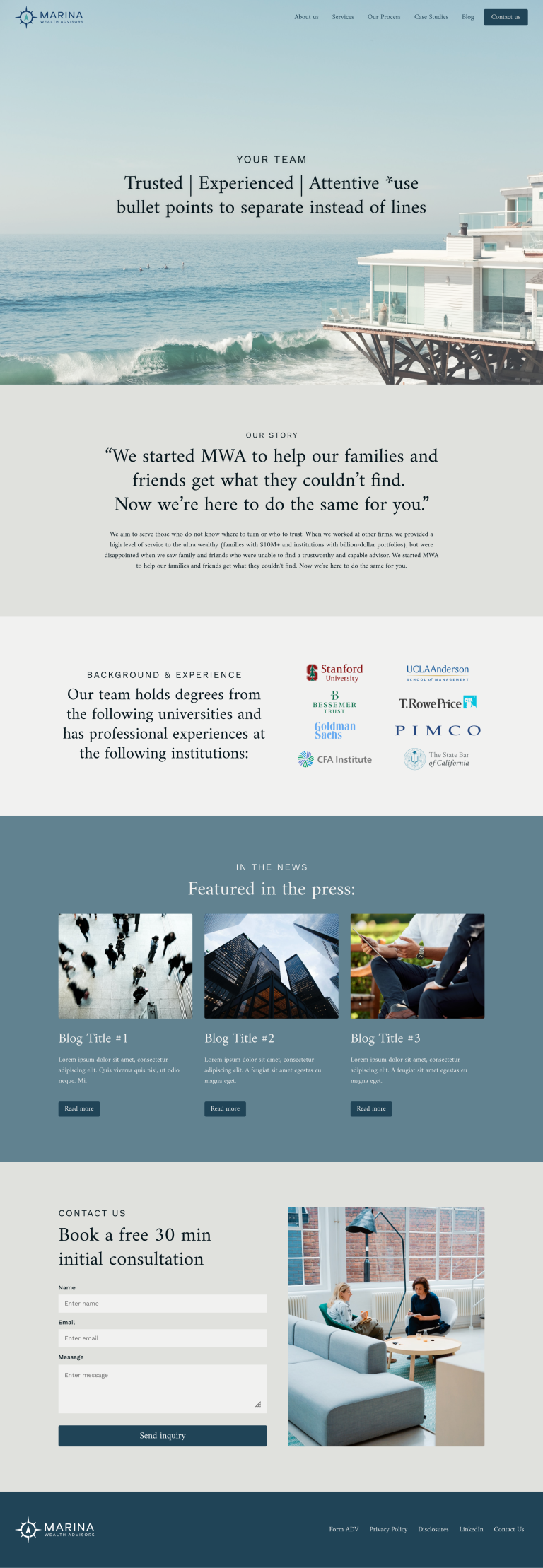
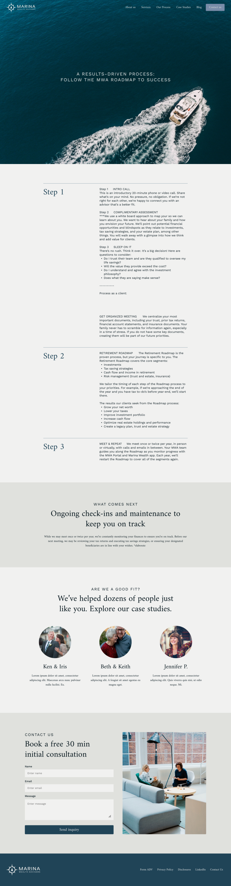
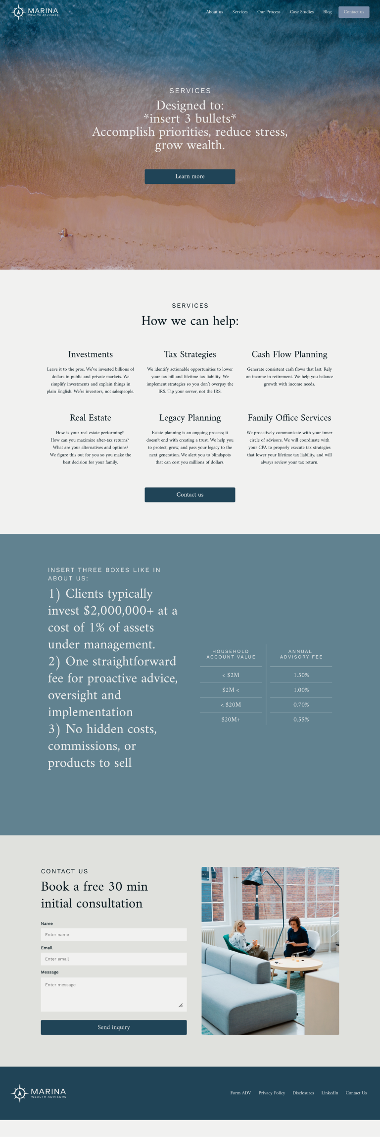
Final Live Website on Desktop
Results + Next Steps
Currently the website is being tested for tablet and mobile responsiveness, to launch end of August. We will immediately add usability tracking to test for average time on page, page views, scroll depths and heat maps, then iterate as needed. Most importantly, we will be tracking the number of lead contacts over time.