Context
Project Objective
Increase client awareness and total bookings of skincare and beauty services
Context
About the Project
My role
User research
Ideation
Interaction design
Design QA
Team
Myself
1 Senior Project Manager
1 iOS Developer
1 Android Developer
Timeline
8 months
2022-2023
Team
Figma
Maze
Problem and Opportunities
The Main Problem
At the beginning of 2023, Soothe was live for 6 markets for hair and facials, 3 markets for beauty, and 2 markets for nails with plans to scale to all markets quickly.
From a business perspective, we noticed that demand and fill rates were currently very low, which made it difficult to recruit and retain more providers and grow demand on the client side of the business.
Through qualitative interviews and quantitative surveys, we discovered that clients had very little awareness about the services offered in their area, and the current booking process limited discoverability.
Problem and Opportunities
Business Case
01.
Increase weekly average requested skincare and beauty appointments
02.
Gather an interest list of clients in markets that don’t offer skincare or beauty services, so we can target them when we do.
03.
Maintain or grow the number of rebooking requests initiated from the home screen to promote discoverability
The Before

UX Problems
Lack of Customization
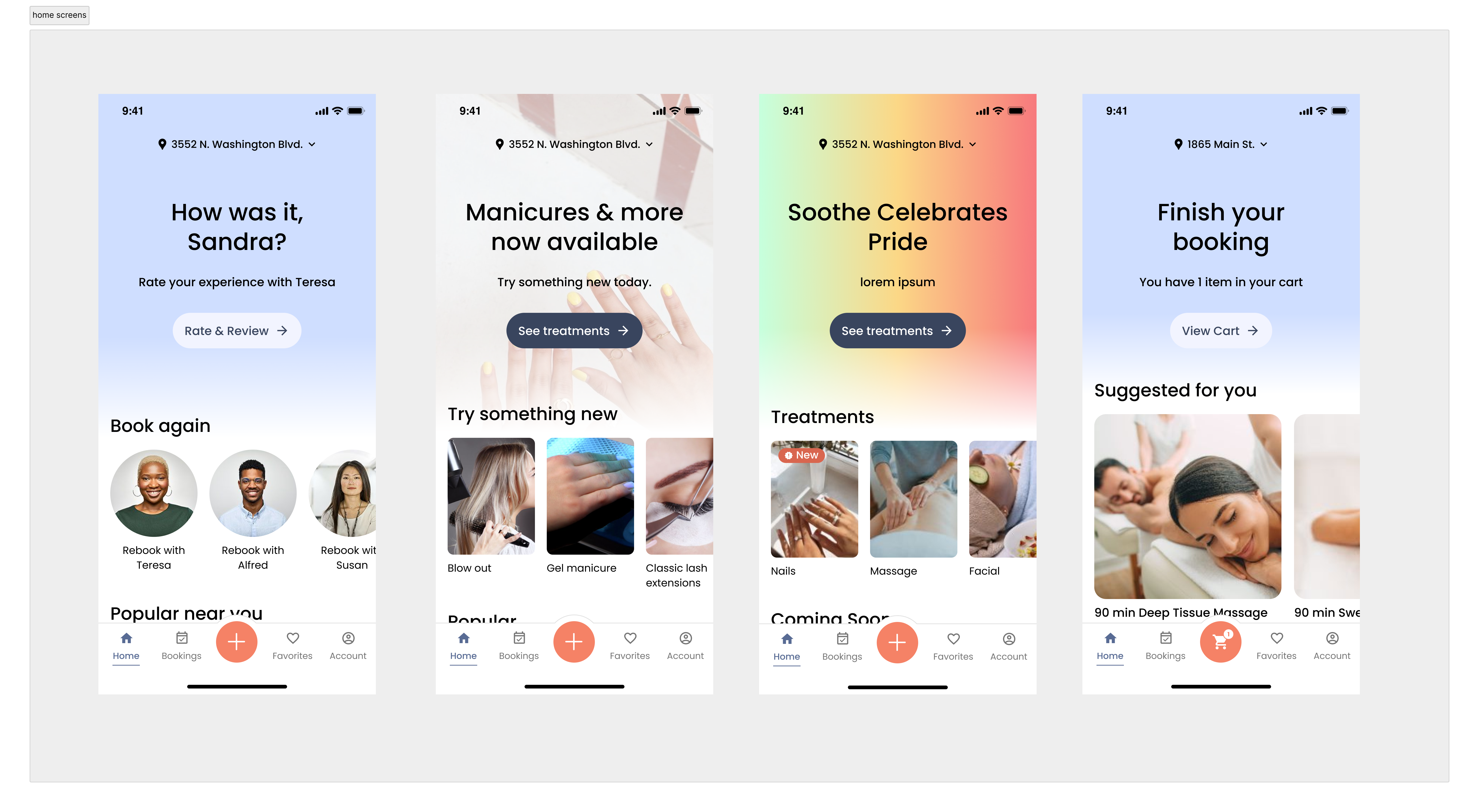
The home page could not be customized to the client's location, which meant that we could not advertise new skincare or beauty services or create specific marketing campaigns in app.
Lengthy Booking Process
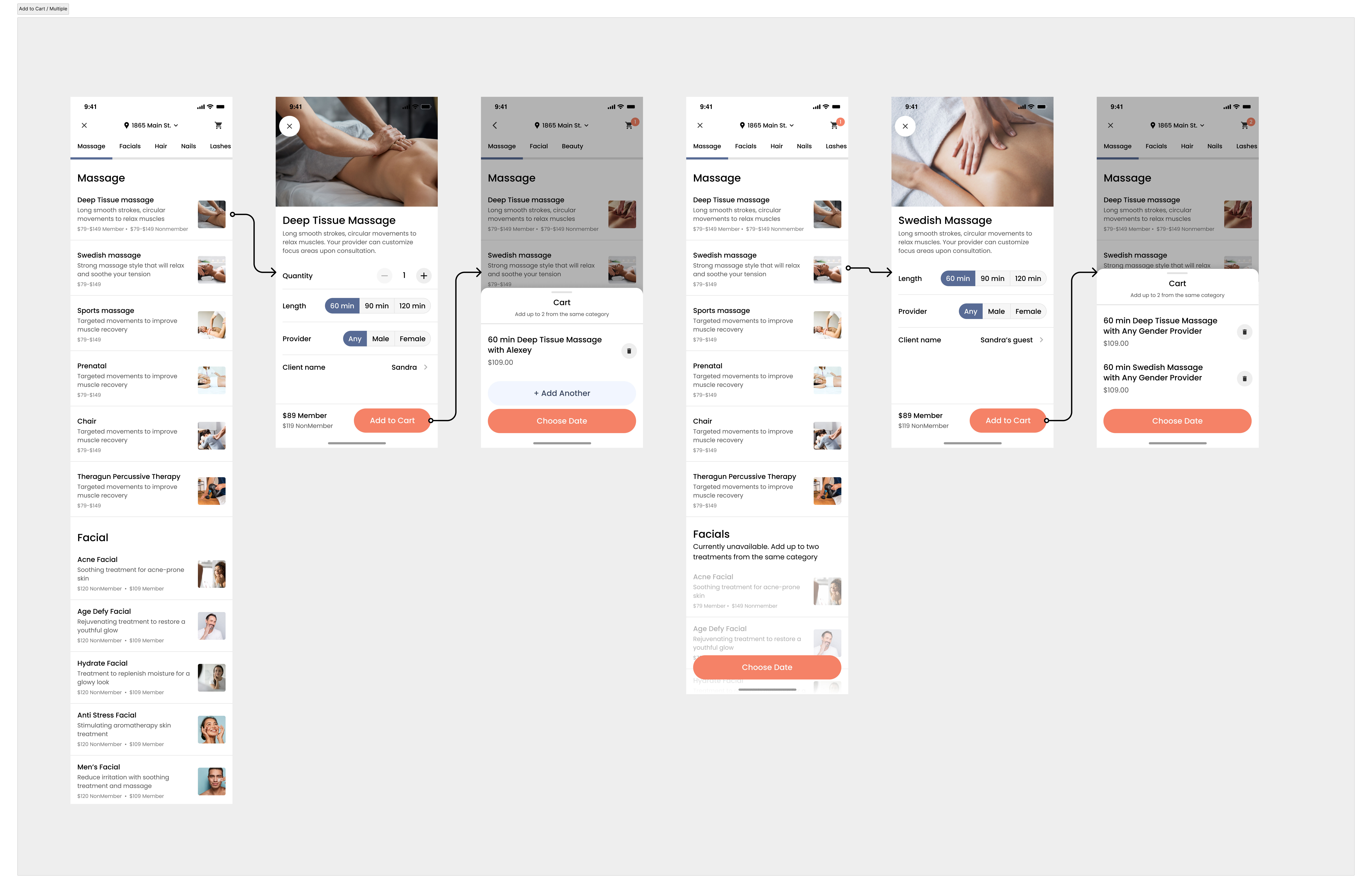
The booking flow took too many steps and was not optimized for repeat bookers. Every time someone wanted to book, they were required to choose their address so that we could query available services at their location.
Difficult to Explore
Due to the sequencing of steps to select number of clients and date, it made if difficult to get deep into the funnel just to see available modalities and pricing.
Progress Wasn't Saved
If a client exited the booking flow after exploring services, they cold not save their progress. This was not only frustrating for clients, but it lowered conversion rates and marketing could not send optimized, custom messages to help clients pick up where they left off.
The Solutions


Results + Next Steps*
Increase in the weekly average requested skincare and beauty appointments
The number of people who subscribed to be contacted when skincare and beauty services are launched in their area
Increase in the number of requests made from the home screen shortcuts
The project has been split into multiple parts and is still ongoing. The homescreen was launch in early 2023, with booking flow iterations still in development, slated to be released May 2023. More results to follow. In the meantime, Soothe received some press highlighting the expansion of services, as seen in the video below.


